This
is a good map, possibly the best I've made. For all of
you who dont know, this map, "Oblivion," was
originally designed for Unreal Tournament. My little bro
is into UT, and so I play it sometimes. I was playing
this map when I realized -- this would make a great quake
tourney. As you might expect, I set off to work. After
about two weeks, I got this. I tried to create the exact
same oblivion with quake textures. What I came up with
was a slightly bigger and brighter oblivion with quake
textures. As far as the looks go, the map is very strictly
angular. I only have a few curves in the entire level.
From first look, the map might appear bland, but when
you look around you will realize that there is more detail
than it seems. I always thought the map (and many others)
in UT was bland, but when I was making this map, I realized
that I was wrong. It took me much longer than expected
to get all the little things in and also angle the brushes
correctly. However, it still isnt nearly as detailed as
many other futuristic maps out there, and there is the
problem with the "jaggies". See, some of the
detail called for very thin brushes, some even coming
down to a point. In the game, these brushes appear to
have jagged edges, hence the name jaggies. BTW, "brushes"
are just individual shapes in a map. For example, the
floor of a room would be a brush. The ceiling would be
another. If you are familiar with Q3Radient or have read
my tutorials, you should be very familiar with terminology
like that. This map has perfect aesthetics (you will find
that many maps do). The item placement is good for its
tourney size, and the map flows well. All parts are connected
somehow, making it easier to get around. The map is located
entirely indoors, on a spaceship. In Unreal Tournament,
there is a really cool hyperspace effect outside. Since
I'm horrible at writing shader files for quake, I had
to leave that special feature out, and use a nightime
sky. Just pretend that the ship is moving REALLY slowly.
=) Of course, it is a futuristic map (who ever heard of
a gothic spaceship?) A brief overview would have us started
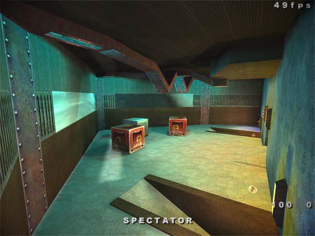
at the front of the ship, where a railgun is located.
That room splits off into three directions: left, center,
and right. The center path leads through a hallway that
has health and windows that overlook the rooms that are
accessed by taking the left or right paths from the first
room. The center path eventually leads out into the back
room, which I will talk about in a minute. If you take
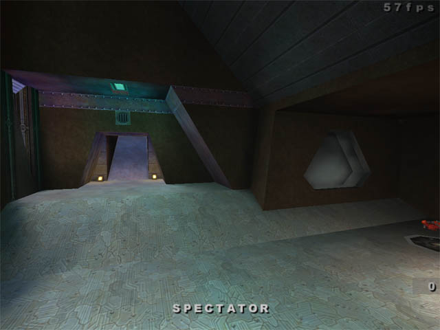
the left or right paths from the railgun room, you will
find yourself going down ramps to a lower-level section
of the map (if you could even consider it a lower level;
the map certainly has no vertical play aspects.) In this
"lower-level" section are two rooms with vaulted
ceilings, one room on each side. In one room you will
find the Rocket launcher on the opposide side, ammo for
it. The two rooms are connected by a hallway that goes
below the central path leading out of the first room.
In this hallway you will find a mirror, some +5 healths,
and the level's only armor, a mere 3 or 4 shards. There
are no other paths leading out of this hallway. Finally,
the back room. You can reach the back room by any of the
three paths you take from the front room. Lower level
rooms have rams leading into the room, and the central
path empties you right into it. This back room is the
largest room, and contains health, and a shotgun. The
shotgun is located in one of the boxes in the back. The
map flows very well, so I just had to give it a perfect
score because nothing is wrong in that section. Hehe,
I gave playability a perfect score as well. The map just
plays very well; thats all there is to it. This map is
best played with two or three people. Any more and it
just seems to cramped, even though four people do fit
in it quite easily. Tourneys are the best thing to play
in it, especially because the map keeps the action going
even with only two people. I dont really think I need
to say any more about the playability. Finally, the fun
factor. Because of the Aesthetics and Playability, the
map is fun. You wont be moving around for more than 10
or 15 seconds without finding another person. The action
keeps on going, and sometimes you might find yourself
low on ammo or health becuase you didnt have time away
from the action to power up. That fact adds to the fun
as well. Also, the Unreal Tournament look of the map should
attract UT fans; it might prove to be a way to switch
them over to being a quake fan. The only reason I took
off of Fun Factor points was because of the maps small
size; you get used to it very easily and its less fun
to play in a map where everything becomes expected. So,
overall, I would say this is a very good conversion from
UT to Quake, especially with it being my first ever. I
have some other UT maps that I would like to convert sometime
as well, but I prefer to go with original ideas first.
The overall rating was an 89 on this. I would say that
this is my best map so far. I have yet to earn an "A",
however.